OBJECTIVE
Design the brand identity for an original restaurant. Create the wordmark, menu, digital advertising, and any merchandise that comes with the brand.
RESTAURANT CONCEPT AND VALUES
Astral is an American retro-themed diner, housed in the Comet Observatory of the Super Mario Galaxy video game universe. It is a rest-stop for all heroes, villains, and denizens of the multiverse. People come from far and wide in the galaxies for an early-morning breakfast, a quick bite, a relaxing lunch, or a family-friendly dinner. Astral has it all for its wide range of audiences.
Owned and operated by the Lumas, a main species in the game, Astral values loyalty, community, and comfort.
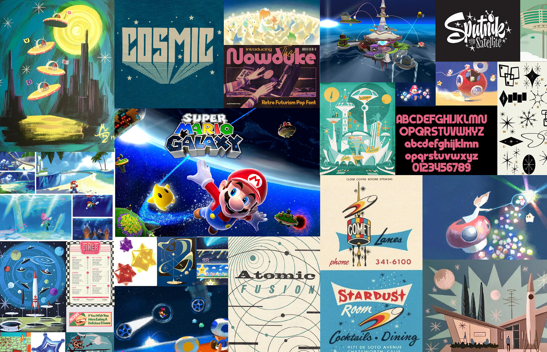
MOODBOARD AND ORIGINS
I was inspired by the 2007 Nintendo video game, Super Mario Galaxy, to create an in-universe restaurant. The concept art and the game itself felt nostalgic for me, as I grew up an avid player, so I wanted to design a brand that makes people feel comfort in hard times– in a space that took place in a video game universe! It was a unique experience to expand upon the lore of the game and put myself into those characters' shoes.
I would keep getting suggestions along the entire process to make everything feel "more like a video game", like the original Super Mario Bros, so with each choice along the design process, I thought about it as if I were in the game and a regular citizen.
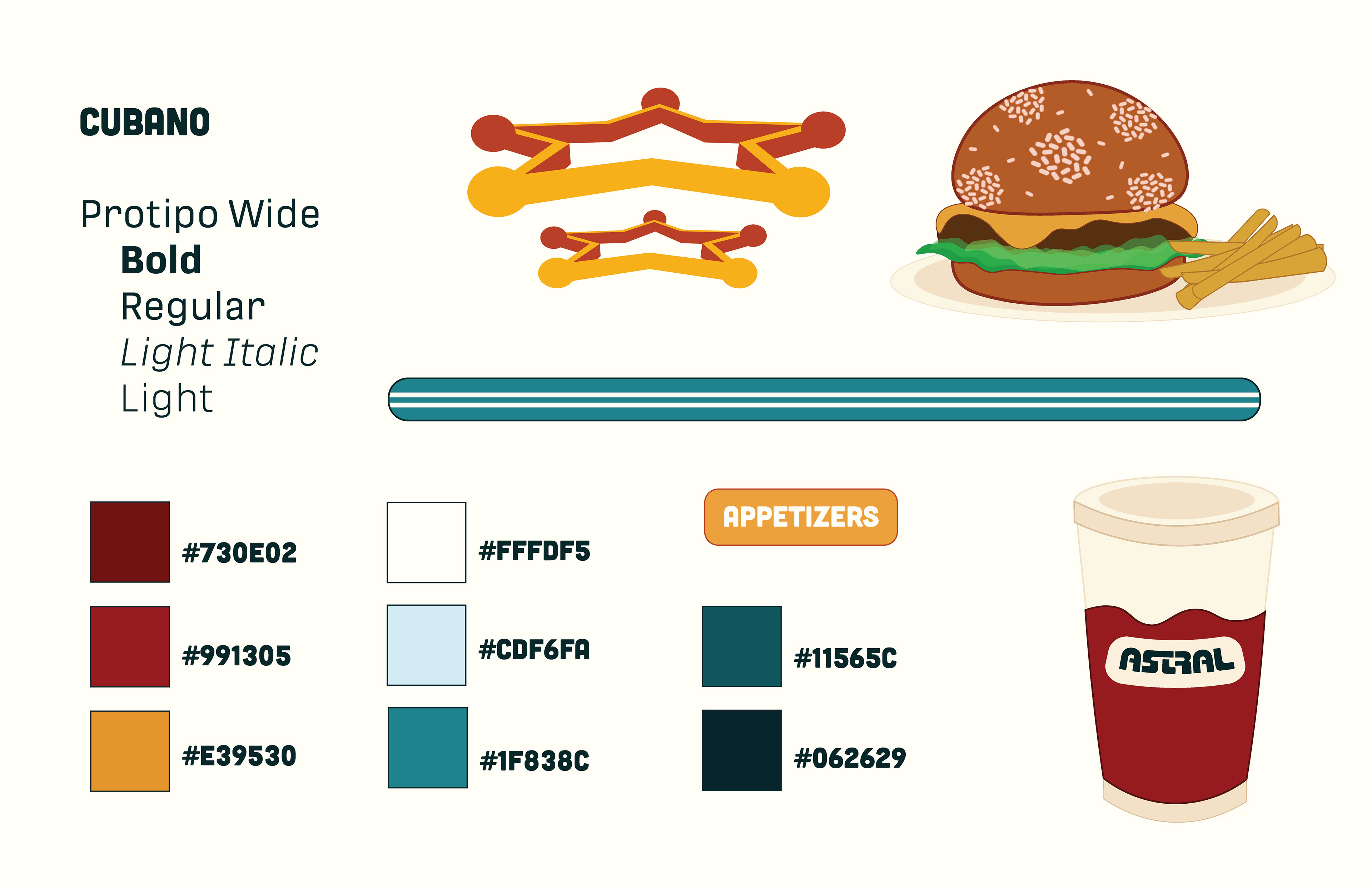
The brand of the restaurant was inspired by retrofuturistic and mid-century modern design. I felt it could be appropriate to emulate a nostalgic feeling while still fitting into an outer space world.
"If I were Mario, I would want to come back to a comfortable diner after a long day of battling bosses."
WORDMARK PROCESS
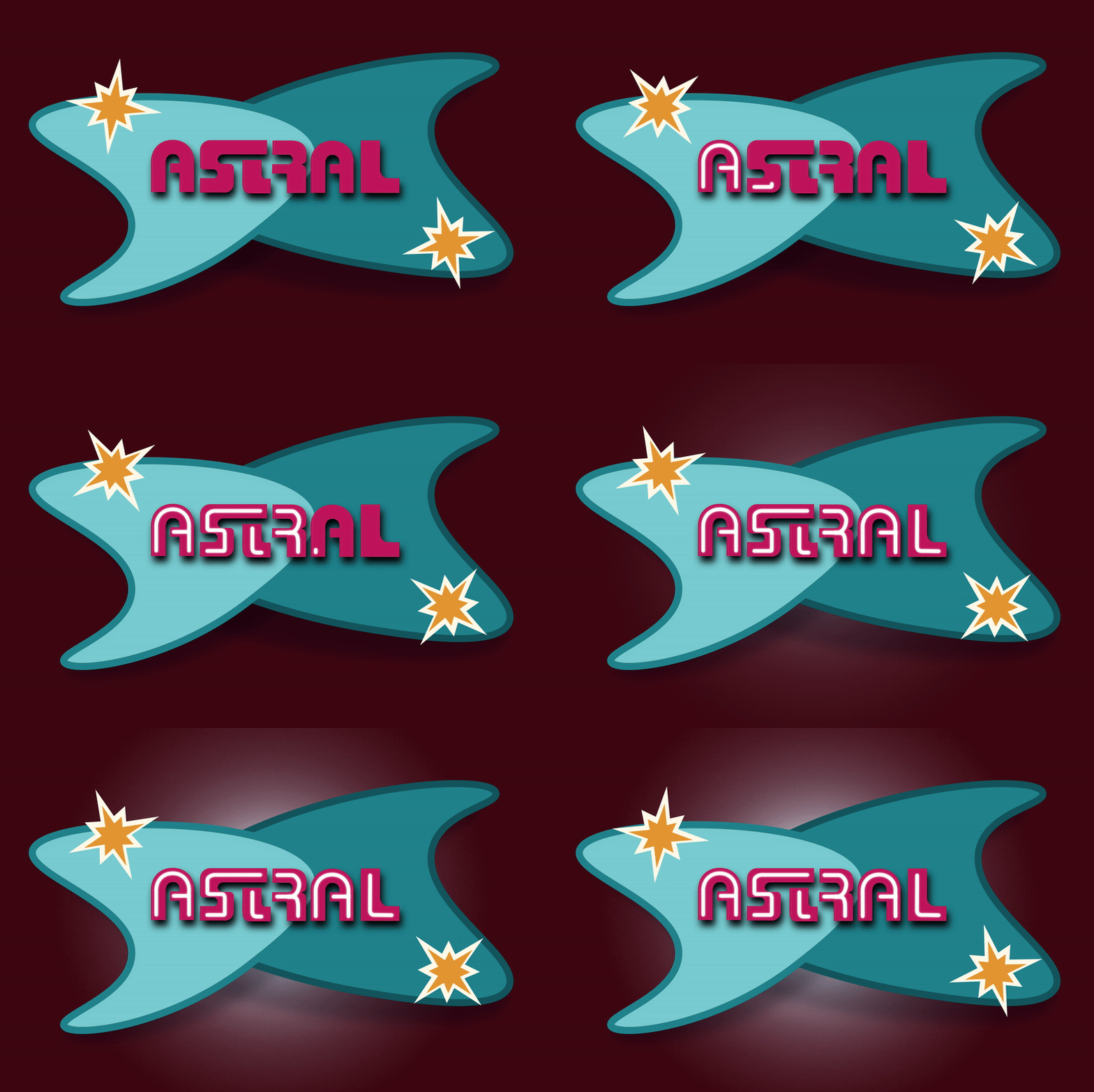
Using the restaurant's values of loyalty, community, and comfort, and combining it with typefaces from mid-century modern and retrofuturistic designs, I played around to see how those values could represent Astral's logo.
Eventually, I settled on a final wordmark consisting of chunky sans-serif letters in all caps. The weight of the letters depicted familiarity and strength, while the precise measuring of bar widths and eye-catching ligatures depicted togetherness.

MENU PROCESS
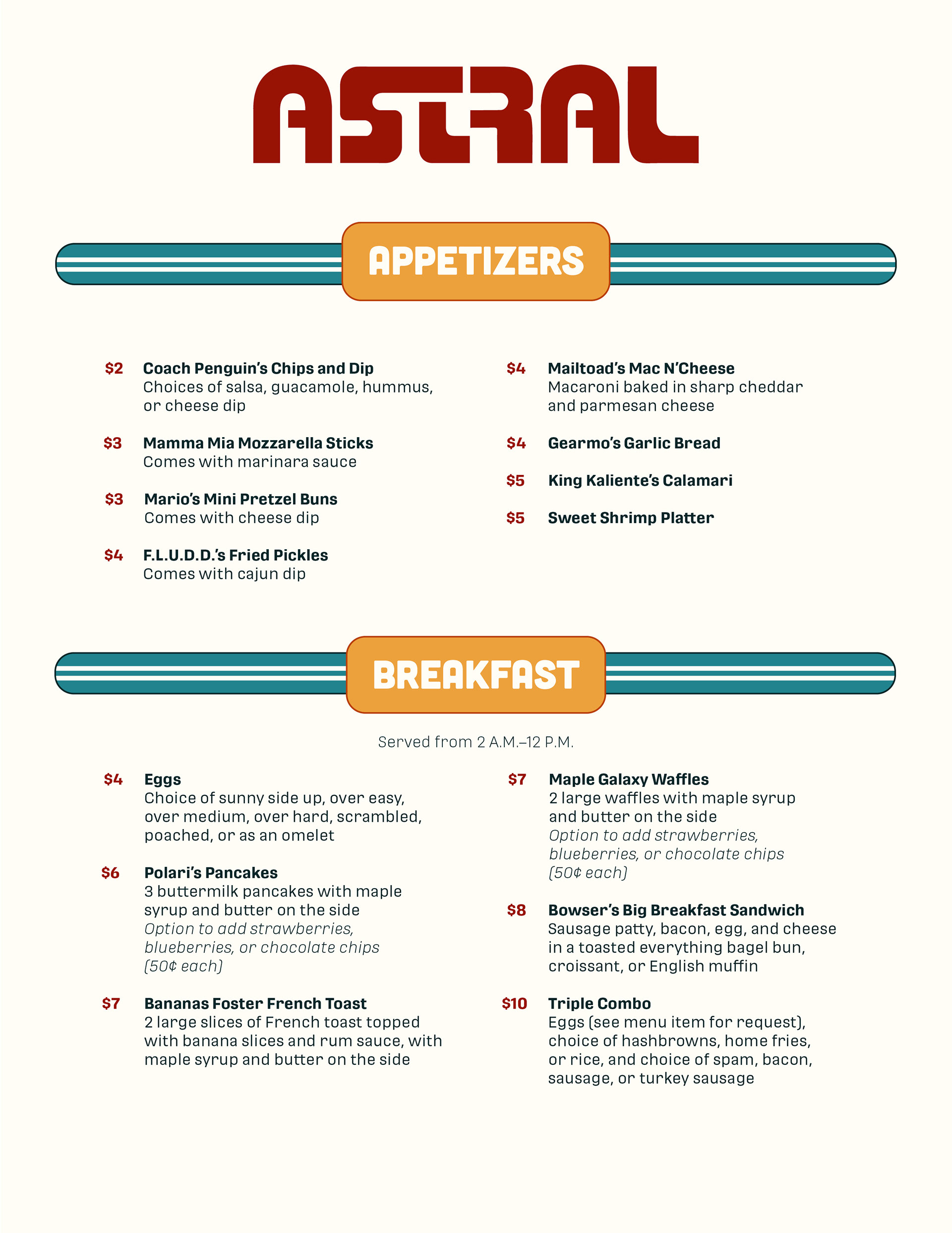
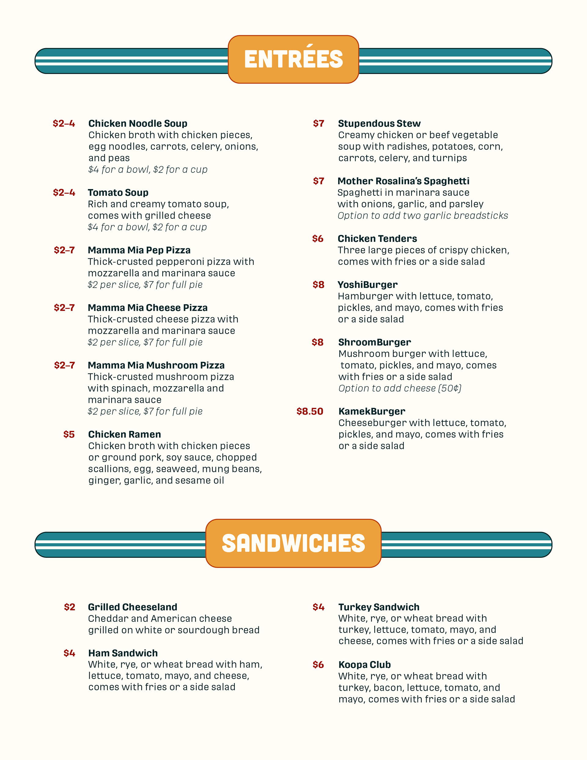
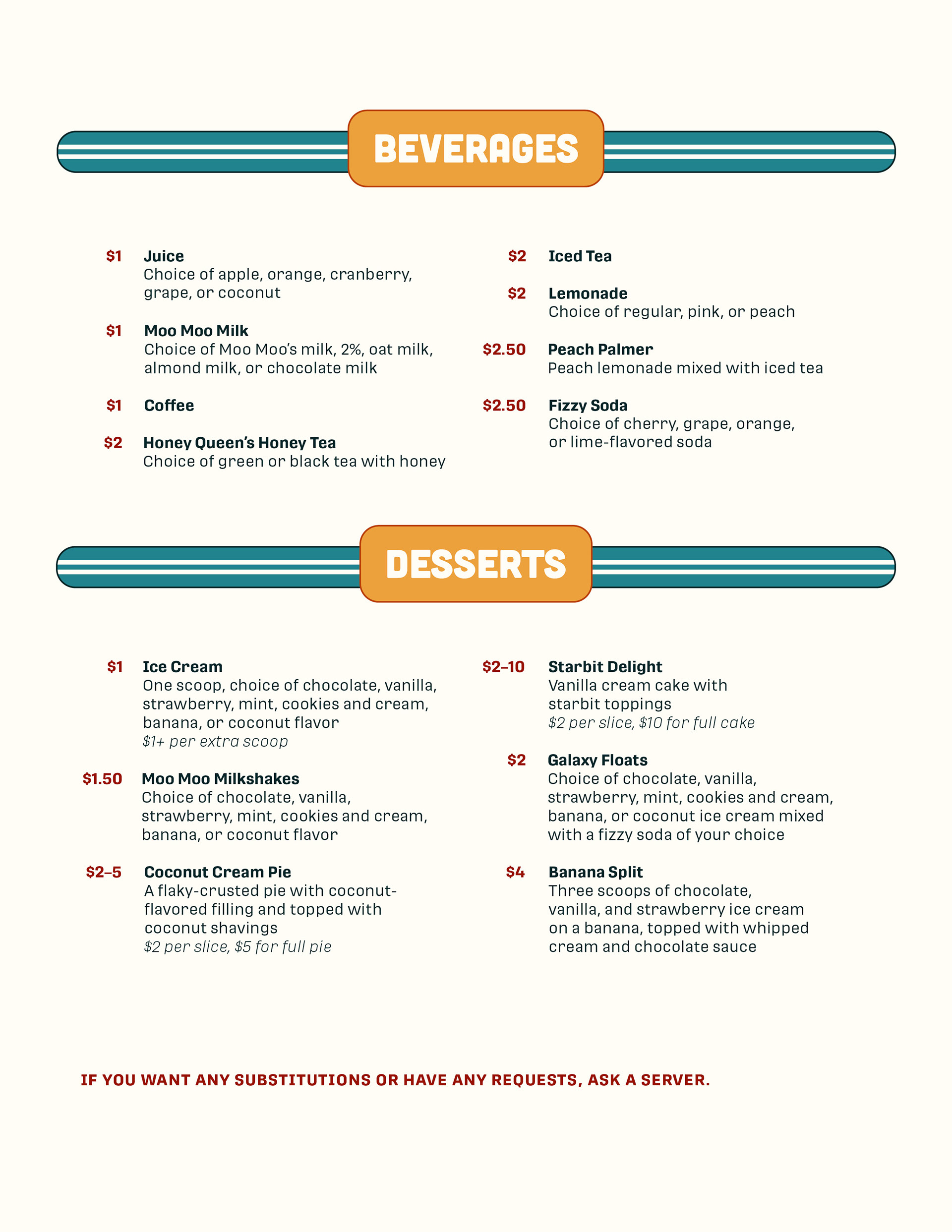
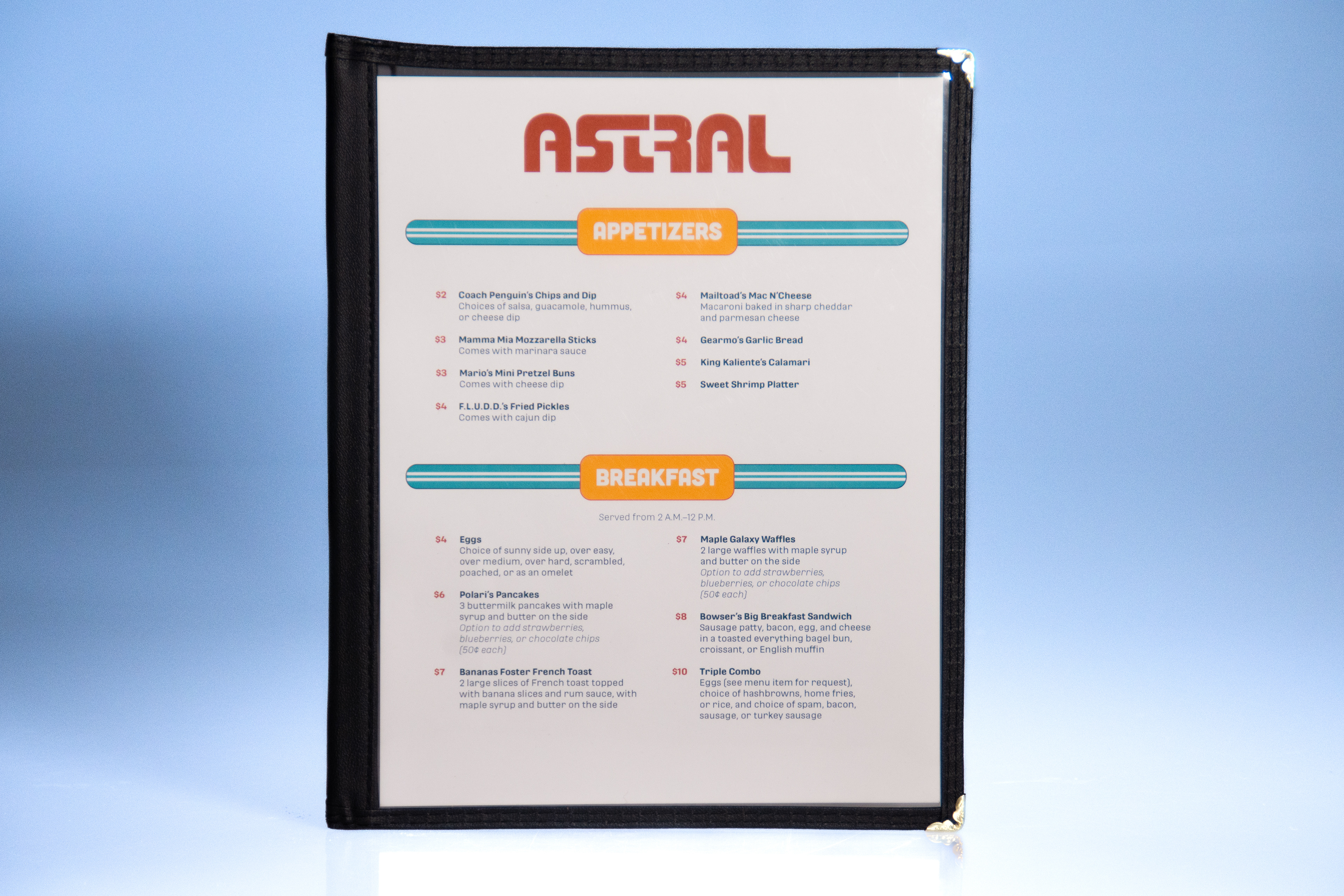
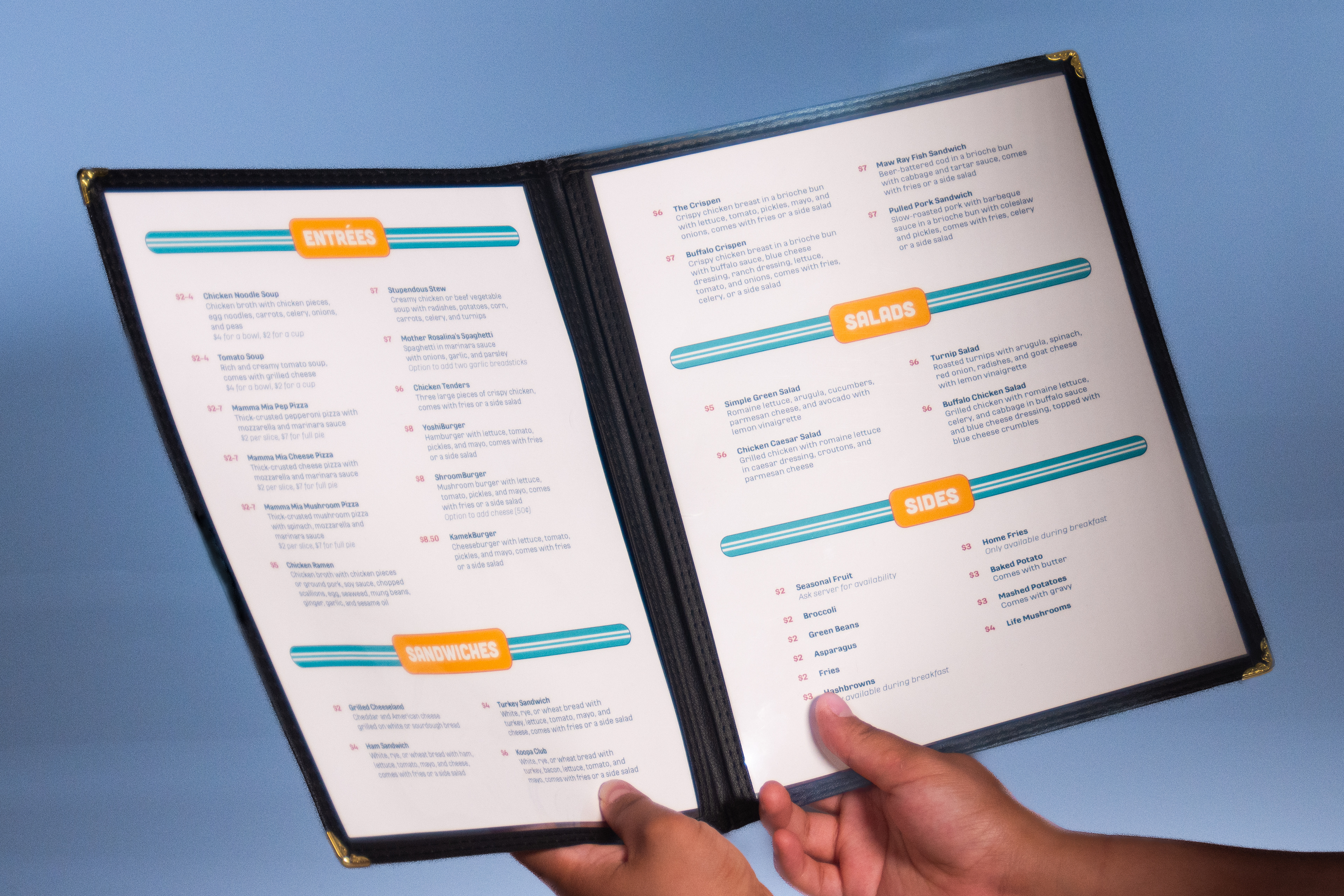
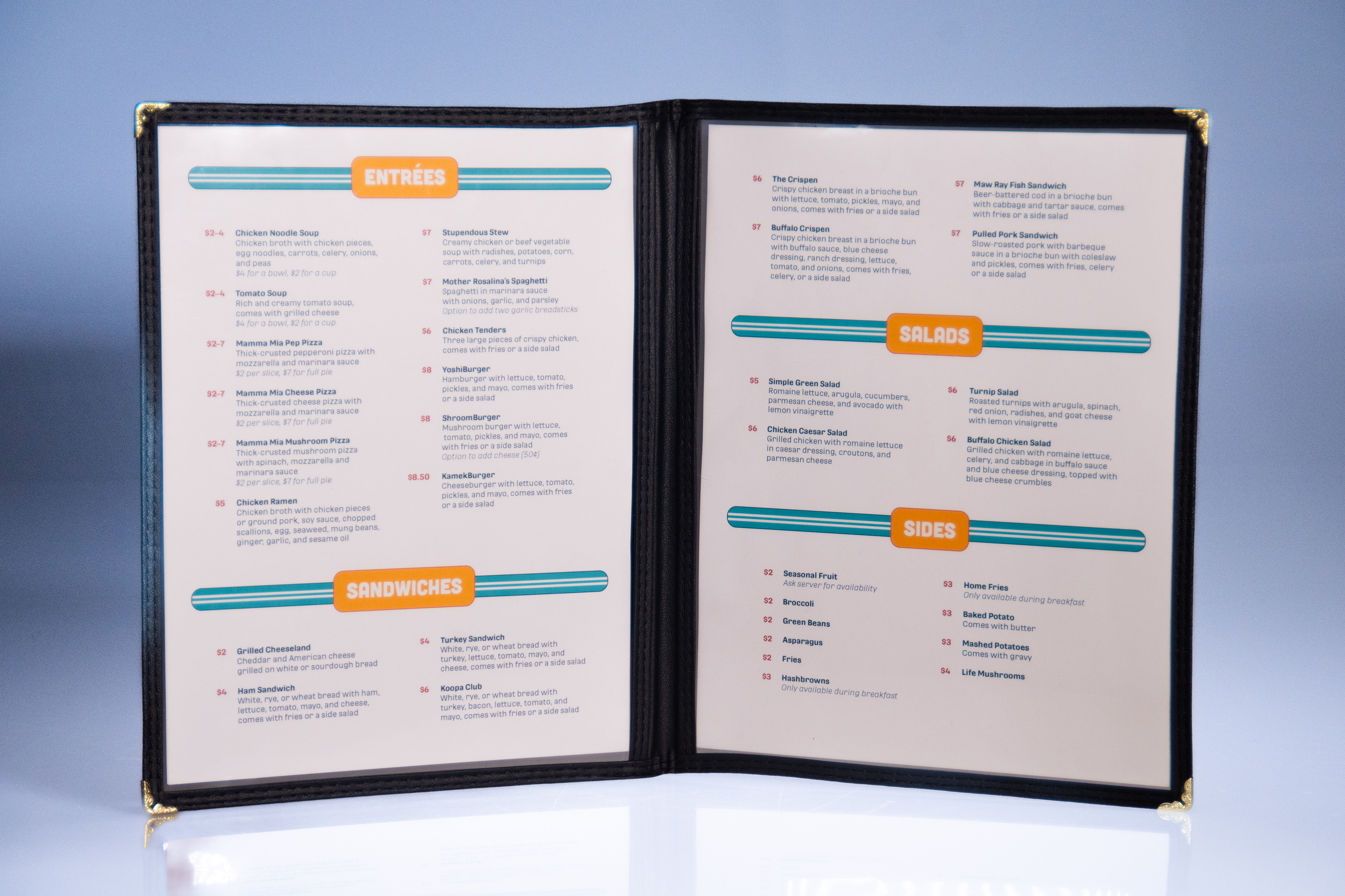
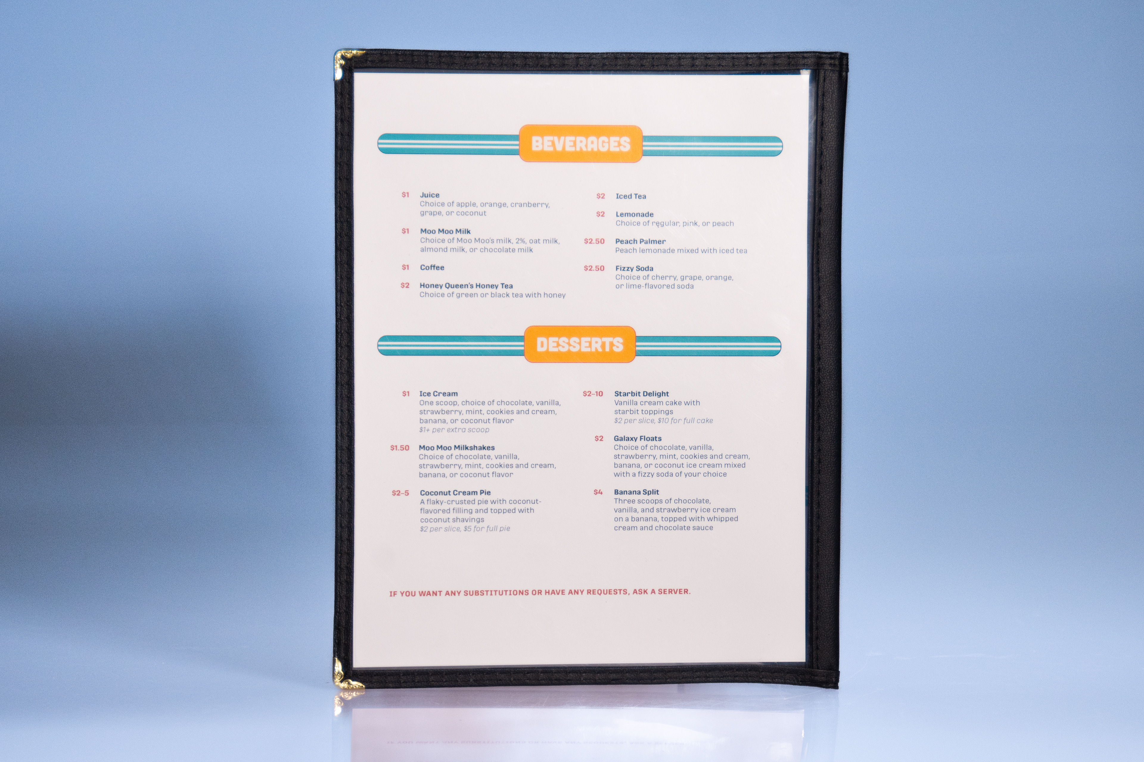
Going along with the restaurant's values, I settled for a simpler menu with plenty of choices, perfect for the diversity of customers that may come. When thinking in-universe, having a simpler menu works for regulars who want to return to the familiarity of the food and for newcomers who want to try new things.

ANIMATED BILLBOARD PROCESS
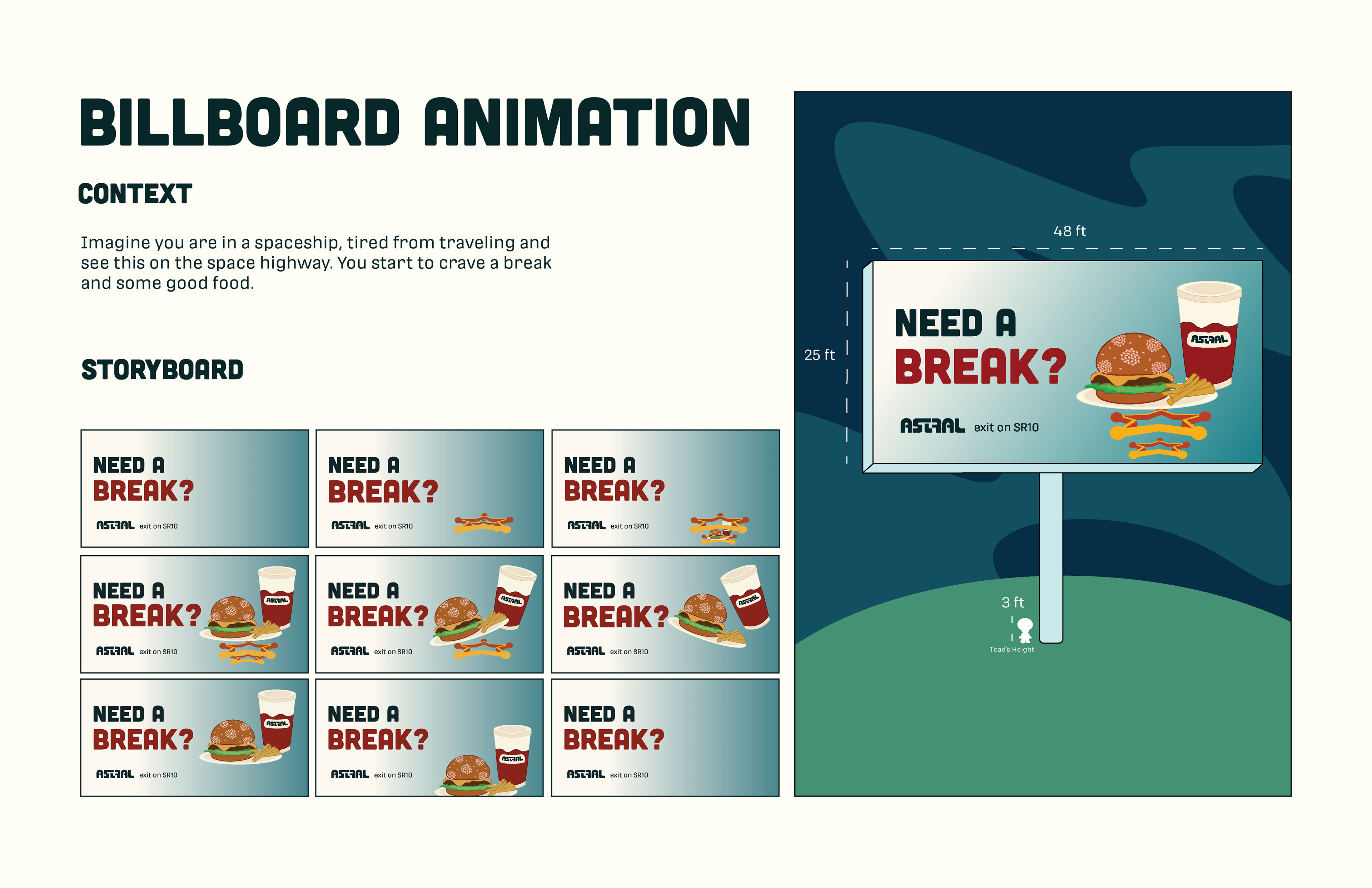
For my digital touchpoint, I decided that it would make the most sense to have a digital billboard advertising the food! There are no websites or social media in the Super Mario universe (circa 2007), so having an eye-catching billboard that can be found in many worlds was fitting.
FINAL BRAND
